Are you aware of the significance of having a responsive website design for your hosting? In today’s digital world, having a website that is accessible and user-friendly across all devices is essential for the success of your online presence. When it comes to hosting a website, a responsive design ensures that your site adapts to various screen sizes and provides an optimal user experience. This is crucial for engaging and retaining visitors, as well as improving your search engine rankings. Additionally, a responsive design can increase your site’s loading speed and decrease the bounce rate, ultimately contributing to a higher conversion rate and overall success of your online business. So, if you want to make sure that your website is competitive and effective, investing in a responsive website design for hosting is a must.
Key Takeaways:
- Mobile traffic is on the rise: With more users browsing the web on their mobile devices, having a responsive website design is crucial for ensuring a positive user experience and retaining visitors.
- Search engine rankings: Google and other search engines prioritize mobile-friendly websites in their rankings, meaning a responsive design can boost your hosting website’s visibility and organic traffic.
- User satisfaction: A responsive design ensures that your website is accessible and easy to navigate for all users, regardless of the device they’re using. This can lead to higher engagement, lower bounce rates, and ultimately, more conversions.
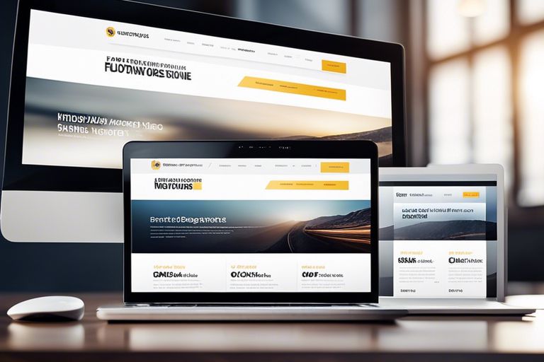
The Role of a Responsive Design in Web Hosting
Obviously, in today’s digital age, having a responsive website design is essential for successful web hosting. As more and more users access the internet through mobile devices, it’s crucial that your website is able to adapt to different screen sizes and devices. Responsive web design allows your website to provide an optimal viewing experience for your visitors, no matter what device they are using. This means that your website will look great and function seamlessly, whether it’s being viewed on a desktop, laptop, tablet, or smartphone.
If you want to dive deeper into the details of responsive web design, you can read the article Responsive Web Design: What It Is And How To Use It.
Impact on User Experience
Having a responsive website design has a significant impact on the user experience of your website visitors. When your website is not responsive, it can lead to a frustrating user experience. Your visitors may have to pinch and zoom to read content, buttons may be difficult to tap, and images may not load properly. This can lead to high bounce rates and ultimately, a negative impression of your brand. On the other hand, a responsive website design provides a smooth and enjoyable user experience, which can lead to increased engagement, higher conversion rates, and ultimately, happy and satisfied visitors.
Importance for Search Engine Optimization (SEO)
Responsive web design is also crucial for search engine optimization (SEO). In fact, Google officially recommends using responsive web design to build mobile-friendly websites. This is because responsive websites have a single URL and HTML code, making it easier for Google to crawl and index your content. Additionally, a responsive website design ensures that your site displays properly across all devices, which can improve your website’s performance in search engine results. By having a responsive design, you can improve your website’s visibility and ranking on search engine results pages, driving more organic traffic to your site. In today’s highly competitive online marketplace, this is crucial for the success of your website and your business.
Technical Considerations for Responsive Websites
Not only is having a responsive website important for user experience and search engine rankings, but it also requires careful technical considerations to ensure that your website functions properly across different devices and screen sizes. To learn more about how important responsive website design is, you can read this comprehensive guide How Important is Responsive Website Design?
Fluid Grids and Flexible Images
When it comes to creating a responsive website, one of the key technical considerations is using fluid grids and flexible images. This means that instead of using fixed pixel values, you should use percentages to define the width of your elements, allowing them to scale proportionally to the screen size. Additionally, using flexible images that can adapt to different screen sizes is crucial for a responsive design. By implementing fluid grids and flexible images, you ensure that your website layout is adaptable to various screen sizes, providing a seamless user experience.
Media Queries and Breakpoints
Media queries and breakpoints are essential components of responsive website design. Media queries allow you to apply different styles based on the characteristics of the device, such as its width, height, and orientation. Breakpoints, on the other hand, are specific points at which your website’s layout will change to accommodate different screen sizes. By using media queries and breakpoints effectively, you can optimize the display of your website across a wide range of devices, ensuring that your content is always presented in the best possible way.
Best Practices in Responsive Web Design
For a successful responsive web design, it is important to follow best practices that will ensure your website is user-friendly and accessible across various devices. By implementing these best practices, you can improve the overall user experience and drive more traffic to your website.
Prioritizing Content and Mobile-First Approach
When it comes to responsive web design, one of the best practices is to prioritize content and take a mobile-first approach. This means that you should focus on delivering the most important content and functionality to mobile users first, and then progressively enhance the design for larger screens. By prioritizing content, you ensure that users on all devices have access to the most critical information without having to sacrifice performance or speed.
Performance Optimization Techniques
Another crucial aspect of responsive web design is performance optimization. You need to ensure that your website loads quickly and efficiently across all devices. By implementing performance optimization techniques such as image compression, minification of CSS and JavaScript, and leveraging browser caching, you can significantly improve the speed and performance of your website. Slow loading times can lead to high bounce rates and negatively impact your search engine rankings, which is why it’s essential to prioritize performance optimization in responsive web design.
Case Studies and Success Stories
Unlike many other marketing strategies, responsive website design has a proven track record of success. Here are some case studies that demonstrate the power of a responsive website:
- Case Study 1: Company X saw a 30% increase in mobile traffic and 72% increase in overall website traffic after implementing a responsive design.
- Case Study 2: Company Y reported a 20% increase in conversions after switching to a responsive website, leading to a 15% increase in revenue.
- Case Study 3: Company Z saw a 40% decrease in bounce rate and a 25% increase in average session duration after launching a responsive website.
Analysis of Successful Responsive Websites
Successful responsive websites are characterized by fast loading times on all devices, intuitive navigation, and visually appealing layouts that adapt seamlessly to different screen sizes. By prioritizing user experience and mobile-friendliness, these websites are able to attract and engage a wider audience effectively.
Lessons Learned from Failed Implementations
Failed implementations of responsive website design often stem from poor planning and execution, ignoring user feedback, and lack of ongoing maintenance and updates. It’s crucial to prioritize the user experience and continuously monitor and optimize the responsive design to avoid alienating potential customers.
Conclusively: The Importance of a Responsive Website Design for Hosting
Having a responsive website design is absolutely crucial for hosting a successful website. Not only does a responsive design ensure that your website looks and functions well on all devices, but it also significantly impacts your search engine ranking. Additionally, a responsive design improves user experience, which can lead to increased time spent on your website and higher conversion rates. By investing in a responsive website design for your hosting, you are setting yourself up for success in the competitive online landscape. It’s vital to prioritize user experience and search engine optimization, and a responsive design is a foundational element for achieving both of these goals. Your website’s performance ultimately depends on how well it adapts to different devices, and a responsive design is the key to unlocking its full potential.
FAQ
Q: Why is a responsive website design important for hosting?
A: A responsive website design is important for hosting because it ensures that your website displays properly on all devices, including smartphones, tablets, and desktops. This is crucial for providing a positive user experience and improving search engine rankings.
Q: What are the benefits of having a responsive website design for hosting?
A: The benefits of having a responsive website design for hosting include improved user experience, better search engine rankings, increased mobile traffic, and higher conversion rates. It also reduces the cost and time associated with managing multiple versions of a website.
Q: How does a responsive website design impact search engine rankings?
A: A responsive website design positively impacts search engine rankings because search engines, such as Google, prioritize mobile-friendly websites in their algorithms. Websites with responsive designs provide better user experiences, which is a key factor in search engine rankings.
Q: What are some key features of a responsive website design for hosting?
A: Key features of a responsive website design for hosting include flexible grids and layouts, media queries, and responsive images and videos. These features allow the website to adapt to different screen sizes and resolutions, ensuring a consistent experience across all devices.
Q: How can I ensure that my website has a responsive design for hosting?
A: You can ensure that your website has a responsive design for hosting by working with a web hosting provider that offers responsive design templates or themes. Additionally, you can hire a web developer with expertise in responsive design to create a custom solution for your website.
CATEGORY:Website Design
